The best school districts are the likeliest to have met the 40B target
Chapter 40B lets a developer override local zoning in any Massachusetts town where fewer than 10% of homes are on the state’s subsidized inventory. The usual story is that the expensive suburbs hold out. The state’s own September 2025 count says the reverse: 14 of the 23 Tier 1 towns are at or over the line, against 37 of 112 in Tier 3, and by price the share climbs from a median 7.1% in the cheapest quarter of towns to 9.9% in the dearest. The towns also bunch at the line — 21 in the point just below 10%, 35 in the point just above — and Maynard is one unit short.
Chapter 40B is the Massachusetts law that lets a developer override local zoning in any town where fewer than 10% of year-round homes are on the state’s Subsidized Housing Inventory — provided a share of what gets built is affordable. At or above 10%, the town gets its zoning back. That single line is why the percentage matters and the unit count on its own means almost nothing.
The story usually told about it is that the expensive suburbs are the ones holding out: dear houses, strong schools, large lots, and no appetite for apartments. The state publishes its count town by town, and the count does not say that.
The top school tier is the likeliest to be over the line
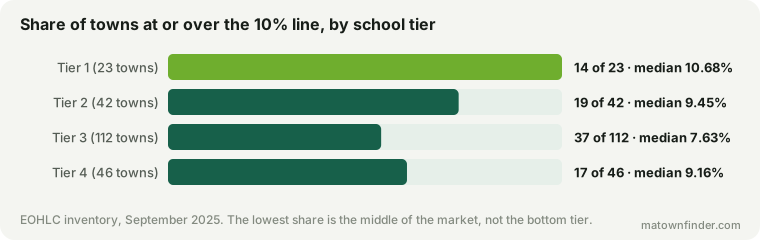
14 of the 23 Tier 1 towns are at or above 10% — 61%, the highest of any tier. The lowest is not the bottom tier but the ordinary middle of the market: 37 of 112 Tier 3 towns, or 33%, with a median of 7.63% against 10.68% at the top.
The bottom tier sits between them for a reason that has little to do with 40B: it includes the cities, which carry large stocks of public housing, much of it older than the law: Boston (21.54%), Holyoke (19.44%), Chelsea (16.68%), Springfield (16.54%).
By price, the share climbs all the way up
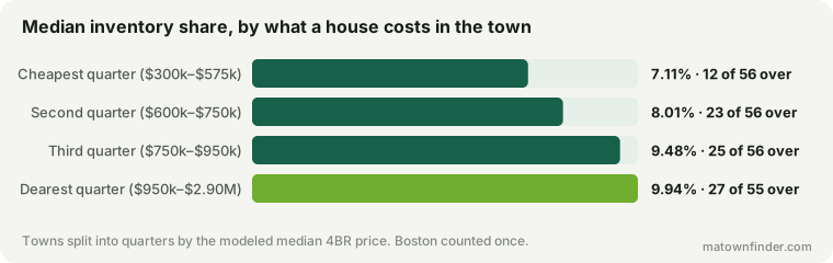
Sorted by what a house costs rather than by schools, the pattern is a plain gradient. In the cheapest quarter of towns the median is 7.11% and 12 of 56 are over the line. In the dearest quarter it is 9.94%, with 27 of 55 over.
It is worth being plain that this is a pattern in counts, not a tight relationship. Price and the inventory share correlate at only r = 0.13, because the spread within every quarter is enormous — Dunstable, a Tier 2 town at $800k, has 0.00%. The claim is not that dear towns have more subsidized housing. It is that they are more likely to have crossed the line, which is a different and more specific thing.
And the towns bunch at the line
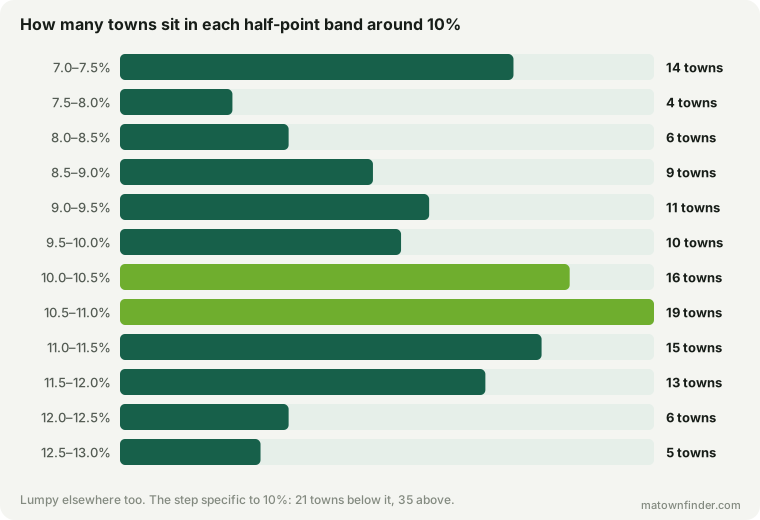
If the 10% line did not change what towns do, the count of towns would drift smoothly through it. It does not. 21 towns sit in the percentage point just below the line; 35 sit in the point just above. The band from 9.5% to 10% holds 10; the band from 10% to 10.5% holds 16.
The chart is lumpy elsewhere too — 14 towns sit between 7% and 7.5%, where no law draws a line — so the bars alone would prove little. The evidence is where the excess falls: exactly across the point the statute names. A pile-up just over a legal threshold is the pattern economists look for when they want to know whether a rule is shaping behavior, and it is the nearest thing in this data to evidence about why the rest of the picture looks the way it does. Towns appear to build up to the line and then stop.
Some have not quite got there. Maynard holds 472 units against a year-round stock of 4,730 — it is one unit short.
| Nearest to the line | Inventory | Units short | Year-round homes |
|---|---|---|---|
| Maynard | 9.98% | 1 | 4,730 |
| Southborough | 9.94% | 3 | 3,734 |
| Rockland | 9.96% | 3 | 7,240 |
| Holbrook | 9.79% | 10 | 4,404 |
| Easton | 9.84% | 15 | 9,087 |
| Groveland | 9.26% | 20 | 2,582 |
| Reading | 9.80% | 21 | 9,901 |
| Haverhill | 9.91% | 25 | 27,869 |
| Middleborough | 9.75% | 25 | 9,732 |
| Medfield | 9.45% | 25 | 4,432 |
Why, and what this cannot tell you
The standard account of this pattern runs through the economics of a 40B project. The market-rate homes in a development are what pay for the affordable ones, so a project only works where market-rate homes sell for a great deal. That puts the pressure on exactly the dear, strong-school towns — and many of them responded by building up to 10%, through 40B developments or their own, to take their zoning back. In a cheap town the same project does not pay, so the pressure never arrives and the share stays low.
That account is consistent with every number above, and none of them proves it. This data records where each town stands, not how it got there or who proposed what. The bunching says the line mattered; it does not say through which door. Treat the mechanism as the likeliest reading, not as a finding.
All twenty-three Tier 1 towns
The headline is a majority, not a rule, and the exceptions are worth seeing because they include some of the dearest towns in the state.
| Town | Inventory | 4BR | Status |
|---|---|---|---|
| Concord | 13.34% | $2.2M | At or over |
| Lincoln | 12.83% | $2.5M | At or over |
| Westford | 12.23% | $1.1M | At or over |
| Sudbury | 11.88% | $1.7M | At or over |
| Needham | 11.85% | $1.85M | At or over |
| Westborough | 11.80% | $950k | At or over |
| Boxborough | 11.35% | $950k | At or over |
| Brookline | 11.13% | $2.05M | At or over |
| Lexington | 11.07% | $2.05M | At or over |
| Hopkinton | 11.07% | $1.25M | At or over |
| Wellesley | 10.95% | $2.25M | At or over |
| Newton | 10.68% | $1.9M | At or over |
| Acton | 10.58% | $1.1M | At or over |
| Wayland | 10.20% | $1.6M | At or over |
| Southborough | 9.94% | $1.25M | 3 short |
| Medfield | 9.45% | $1.35M | 25 short |
| Weston | 8.50% | $2.9M | 60 short |
| Belmont | 6.21% | $1.9M | 411 short |
| Harvard | 5.73% | $1.1M | 94 short |
| Winchester | 4.89% | $1.85M | 413 short |
| Carlisle | 3.17% | $1.5M | 130 short |
| Sherborn | 3.17% | $1.5M | 106 short |
| Dover | 2.82% | $2M | 145 short |
Carlisle (1,893 homes), Sherborn (1,547 homes), Dover (2,018 homes) are the furthest below, and all three are small: the typical town here has 7,375 year-round homes. A small stock cuts both ways: a few dozen units would move any of them a long way toward the line, and none of the three has added them.
How to use this
- Read the percentage, never the count. Every town page on this site carries it, to two decimals, because the line is the point: at one decimal Maynard and a town at 10.02% would read the same while sitting on opposite sides of it.
- A town under 10% is open to comprehensive permits. If you are buying next to open land in one of the 136 towns below the line, a 40B proposal is a real possibility that local zoning alone cannot rule out.
- A town just over it can fall back under. The denominator is the 2020 Census count of year-round homes and is only refreshed each decade; when it moves, towns within a few units of the line will move with it.
How this was measured
Figures are the Executive Office of Housing and Livable Communities Chapter 40B Subsidized Housing Inventory, current to September 30, 2025 — the state’s own published percentage for each town, which is units on the inventory over year-round housing units in the 2020 Census. The percentage is kept exactly as EOHLC publishes it rather than recomputed, because it is the figure with legal standing. The inventory is published here.
The 223 municipalities this site covers are counted, with Boston once: its neighborhoods share the citywide inventory, and counting them separately would count one city eighteen times. “Units short” is ten percent of the year-round stock, rounded up, less the units on the inventory. Prices and school tiers are this site’s own — see the methodology, or download the tables. Figures as of September 17, 2026.