Good school districts didn’t grow faster. In the worst year, they held up better.
“Buy in a good school district and it will hold its value” is two claims, and ten years of Zillow prices for 223 towns answer them differently. Hold the starting price fixed — cheap towns grew fastest, and strong districts are dear — and school tier, test scores and growth explain none of the difference in appreciation: among towns that started between $423k and $536k, strong districts grew 5.53% a year and the rest 5.41%. But in the weakest year of the decade, 18 of the 23 Tier 1 towns did better than their prices predicted, against about half in every other tier.
“Buy in a good school district and the value will hold” is the most repeated piece of advice in family house-hunting, and it is really two claims. One is that a strong district makes a house a better investment — that it grows faster. The other is that it makes a house a safer one — that it holds up when the market does not. Ten years of Zillow’s price index for the 223 towns here answer the two differently.
The first thing to take out: price
A raw comparison gets this badly wrong. Cheap towns grew fastest over the decade — starting price alone correlates with growth at r = −0.63 — and strong districts are dear. So Tier 1 towns grew 5.26% a year against 6.79% in Tier 4, which looks like a verdict on the schools and is really a verdict on the starting price.
The fair question is whether a strong district grew faster than a town that started at the same price. So each town’s growth is set against what its 2016 price predicts, and what is left over is what the town did on its own.
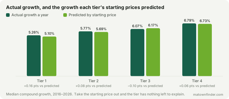
In every tier the actual and the predicted are within a fraction of a point: Tier 1 grew +0.16 points a year against its prediction, Tier 4 +0.06. Take the price out and the school tier has nothing left to explain.
Tested every way the data allows
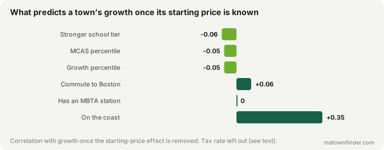
The same result by tier, by test scores and by growth: once starting price is accounted for, a stronger tier comes out at r = −0.06, the MCAS percentile at −0.05, the growth percentile at −0.05. The commute and a train station do no better. The one factor that survives is the one the earlier study of appreciation found: being on the coast, at 0.35.
Put everything into one model at once — starting price, the coast, the commute and the tier — and the tier’s contribution is t = 0.7, which is to say indistinguishable from none. The coast, in the same model, is t = 5.0.
The cleanest version needs no model at all. Strong districts are mostly dear, so there are few price ranges where both kinds of town are common — but there is one. Among towns that started between $423k and $536k in 2016, the 21 with Tier 1 or 2 schools grew 5.53% a year and the 24 without grew 5.41%.
But in the worst year, the top tier held up
The decade has no crash in it, so the second claim — that a strong district protects a house when the market turns — cannot be tested properly. The nearest thing is the weakest single year: 2022 to 2023, when the median town grew 1.28%. And there, the saying has something behind it.
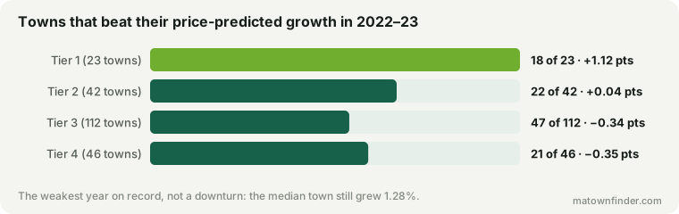
18 of the 23 Tier 1 towns did better that year than their prices predicted — a median of +1.12 points — against about half in every other tier (22 of 42 in Tier 2, 47 of 112 in Tier 3, 21 of 46 in Tier 4). It is not one town carrying the median: the exception is Brookline, which did 5.1 points worse than its price predicted, and the top tier held up despite it.
Hold that in proportion. It is one year, it is twenty-three towns, and a year in which prices still rose is not a downturn. But it is the only evidence here about whether strong districts are safer, and it points the way the saying does.
Where this sits with the earlier study
The study of what made towns appreciate already carried the MCAS percentile in its table and concluded in a line that schools were not a growth engine. This is the full test of that line, and it agrees. The one difference in the numbers is method: that study took price out in dollars and found −0.15 for MCAS; this one takes it out in proportions, which fits the curve of growth against price markedly better, and finds −0.05. Both are small, and neither is positive.
The property tax rate is left out of the model here, for the reason that study gave: the rate on file is this year’s, and a town whose values rose fastest had its rate pushed down by that growth. It is partly a result of appreciation, and it would flatter itself as a cause.
How to use this
- Pay for the schools because you want the schools. The premium buys the district. It does not buy faster growth — it is paid once, at purchase, and then grows at the same rate as any town at that price.
- Do not buy a weaker district as an investment either. The same result runs both ways: a cheap Tier 4 town grew fast because it was cheap, not because of anything about its schools.
- The resilience claim is the half with some support. In the one soft year on record, the top tier held up best. If what you want from a district is protection rather than growth, that is the finding to weigh — lightly, since it is one year.
How this was measured
Growth is the compound annual change in the Zillow Home Value Index, all homes, city level, from 2016 to 2026, for 223 municipalities; Boston’s neighborhoods share the citywide series and count once. “Predicted” growth is a straight-line fit of growth against the logarithm of each town’s 2016 value. Correlations use each town’s growth net of that prediction. The combined model is ordinary least squares on starting price (log), a coastal flag, the commute to Boston and the school tier, with a fit of R² 0.48. The matched band is the fifth of 2016 prices in which strong and other districts were most evenly represented.
School tiers are this site’s editorial grouping; MCAS and growth percentiles are DESE’s district figures. See the methodology, or download the tables. Figures as of September 11, 2026.