What a top school district actually adds to a house price
Close to Boston, a strong district roughly doubles the price. An hour out, the same tier costs 34% more. Most of what you pay for schools is really proximity.
Everyone knows a good school district costs more. Almost nobody can tell you how much more, and the honest answer turns out to depend almost entirely on something that has nothing to do with schools.
The naive version, which is misleading
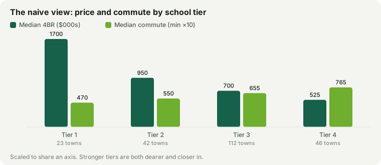
Line the 223 municipalities up by our school tier and the gaps look enormous and simple:
| School tier | Towns | Median 4BR | Median commute |
|---|---|---|---|
| Tier 1 | 23 | $1.7M | 47 min |
| Tier 2 | 42 | $950k | 55 min |
| Tier 3 | 112 | $700k | 66 min |
| Tier 4 | 46 | $525k | 77 min |
A Tier 1 town costs $1M more than a Tier 3 town. You could stop there, and most articles do. But look at the last column: the tiers are not sitting the same distance from Boston. Tier 1 towns average a 47-minute commute and Tier 4 towns 77 minutes. Some of that price gap is schools. Some of it is simply being closer to the largest job market in New England, which people would pay for if the schools were identical.
The controlled version
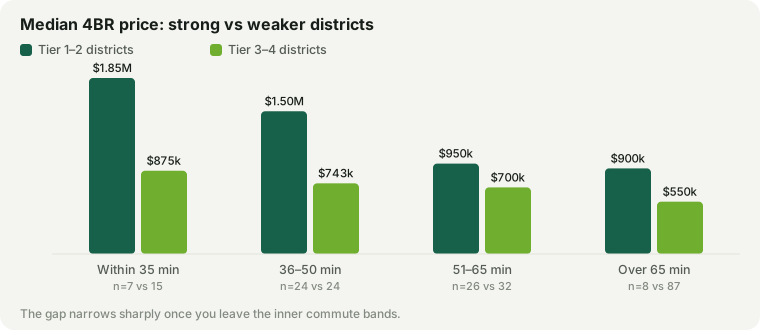
So we held the commute roughly constant and asked the question again: inside a given commute band, what do Tier 1–2 towns cost against Tier 3–4 towns?
| Commute to Boston | Strong (T1–2) | Weaker (T3–4) | Premium | As % |
|---|---|---|---|---|
| Within 35 min | $1.85M | $875k | $975k | 111% |
| 36–50 min | $1.45M | $743k | $708k | 95% |
| 51–65 min | $975k | $725k | $250k | 34% |
| Over 65 min | $925k | $575k | $350k | 61% |
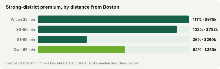
Close to Boston, a strong district roughly doubles the price. Within 35 minutes the premium is $975k — 111% — and in the 51–65 min band it falls to 34%. The same school tier, 77 percentage points cheaper, for about half an hour more driving.
That is the finding, and it reframes the decision. The thing you are paying a fortune for near Boston is not really the district — it is the district and the commute, sold as one item, priced as one item, and impossible to unbundle inside that radius. Move the radius and the school part gets dramatically cheaper.
Where the trend stops, and why we are not smoothing it
The bottom row breaks the pattern: past 65 minutes the premium reads 61%, higher than the band before it. That is not a real reversal, and it would be easy to draw a tidy curve that hides it. It is two different groups of towns sharing one row.
Of the 10 strong-district towns past 65 minutes, 2 are in the Pioneer Valley — Wilbraham at $550k and Longmeadow at $600k — and 8 sit on the outer commuter ring, from the 495 towns round to the Newburyport line, still within commuting orbit and priced accordingly. The median lands between two clusters that have nothing to do with each other, which is exactly the situation where a median stops describing anything. With 10 towns in the group, one row of this table should be read as a shrug rather than a number.
What to do with this
- Price the commute and the district separately. If a strong district near Boston is 111% and the same tier further out is 34%, then most of what you are paying in the inner ring is proximity. Decide whether you are buying it on purpose.
- Half an hour is the cheapest lever you have. Nothing else in this dataset moves the price of a strong district as much as moving the commute band does — not tax rate, not town size, not housing stock.
- Then check the tax bill, which does not follow price. A cheaper house in a further town can carry a larger annual bill, and that recurring cost is not in any of the figures above.
What this is not
- This is a comparison of medians, not a regression. We hold commute roughly constant by banding it; we do not control for house size, lot, age of stock, or town amenities. Strong-district towns also tend to have larger houses, and some of the premium is that.
- Some bands are thin. Sample sizes are printed in the table for exactly this reason. The within 35 min row rests on 7 strong-district towns, and the last row on 10. The two middle bands are the sturdy ones.
- Tier is our editorial grouping. It is built from state MCAS results and publisher rankings, all of which are shown individually on each town page. A tier is a bucket, and the towns inside one are not interchangeable — as the North Shore towns show, one tier can span 60 percentile points.
- Commutes point at downtown Boston — rail legs from the MBTA timetable, driving still modeled. If you do not work there, this entire framing changes — which is the subject of a companion article.
Prices are modeled medians for a 4BR calibrated to Zillow ZHVI and Redfin; school tiers are editorial, built on MA DESE data; commutes are modeled door-to-door to downtown Boston. Data last reviewed . Sources in the methodology. Related: what $750,000 actually buys, and the same premium priced against tuition.