Two numbers explain 82% of what a Massachusetts house costs
Fit the price of all 223 towns against just the school tier and the commute to Boston and you capture 82% of it: each tier is worth about 38%, each commute minute about 0.6%, so an hour costs 45%. The leftovers are the interesting part. The ocean adds 16% that neither variable can see — and a Tier 1 district, which sells at a 19% premium close to Boston, sells at an 18% discount an hour out.

House prices feel like they depend on everything: the schools, the commute, the character of the place, whether the kitchen has been done, what the neighbours are like. Most of that turns out not to matter very much across a whole state.
Take the median 4BR price in all 223 Massachusetts towns this site covers and fit it against exactly two things — the school tier and the modelled commute to downtown Boston. Those two capture 82% of the variation. Everything else any town has to offer is competing for the remaining 18%.
What each one is worth
Because the fit is on log prices, the coefficients come out as percentages rather than dollars, which is how anyone thinks about this anyway.
- One school tier is worth about 37.7% on the price of a house. Moving from a Tier 3 district to a Tier 2 one costs roughly that, holding the commute still.
- One commute minute is worth about 0.62%, which sounds trivial until it compounds: a full hour of extra commute is 44.6% off the price.
Those two exchange rates are the whole market in miniature. A tier of schooling and about an hour of daily travel cost roughly the same thing, which is a genuinely useful way to think about a shortlist: if moving one town further out buys you a better district, the trade is close to even.
The leftovers above the line
The interesting part is what the model gets wrong, because by construction that is everything the two variables cannot see.
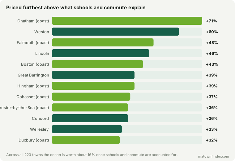
Chatham is the extreme: $1.1M against a predicted $541k, or +71%. It is a Tier 3 district 113 minutes from Boston, and on schools and commute alone it has no business costing what it does.
What it has is the water, and the water is the single biggest thing this model is missing. Across all 223 towns, being coastal is worth about 16% once schools and commute are held constant — 7 of the twelve towns furthest above the line are on it. That is close to half a school tier, bought with something no district can supply, and it sits oddly alongside the fact that not one coastal town in Massachusetts has a Tier 1 district.
The rest of the list is prestige rather than geography: Weston, Lincoln, Concord, Wellesley. Large lots, old money and a name that does work the school tier does not capture — the tier says Tier 1 and so do a dozen other towns, but these ones charge more for it.
The leftovers below the line
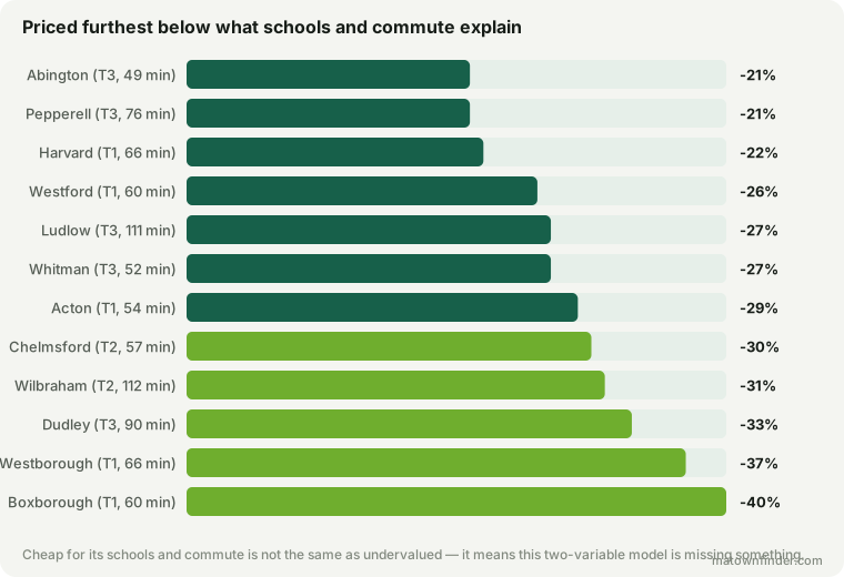
Boxborough is the largest gap in the other direction: $950k against a predicted $1.42M. And the top of this list has a pattern that is worth naming, because it is the most actionable thing here.
A top district costs less when it is far away
Split the Tier 1 towns by distance and the model breaks in a consistent direction. The fifteen inside 50 minutes of Boston sit a mean +19% above what schools and commute predict. The eight at 50 minutes or more sit a mean -18% below it.
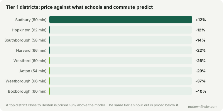
Boxborough at -40%, Westborough at -37%, Acton at -29% — these are top-tier districts trading well below the price their schools would command closer in. The premium people talk about paying for good schools is not really a premium for schools. It is a premium for schools and proximity, sold together, and if you unbundle them the school half is much cheaper than the headline suggests.
Which is the practical version of what we found pricing the district premium directly: close to Boston a strong district roughly doubles the price, an hour out it costs a third more. Here it is again from the other end, and the same eight towns fall out.
What a residual is not
It is not a buy signal, and reading it as one would be the obvious way to misuse this page. A town priced below the model means the model is missing something about that town, and the something is usually real.
For the towns at the top of that list, some candidates: they are almost all west and north-west along the I-495 and Route 2 corridors, where a modelled door-to-door commute flatters a drive that is worse in practice than the number suggests. None of them is coastal. None has the kind of name that does independent work in a listing. Several are small, which makes a median 4BR a thinner estimate than it is in a large town.
The honest reading is narrower and still useful: if you want a Tier 1 district and you can genuinely live with an hour, the market is not charging you the premium it charges everyone else, and these are the towns where that is true.
How this was measured
Ordinary least squares of log median 4BR price on school tier and modelled peak commute to downtown Boston, across the 223 municipalities this site covers. Log prices because houses are priced multiplicatively — a tier is worth a percentage of a town’s price, not a fixed sum, and fitting raw dollars would let the $2.9M towns set the slope for the $400k ones.
Boston’s neighbourhoods are excluded: they share one school district and one tax rate, so eighteen of them would sit at nearly the same point and pull the fit toward the city. School tier is this site’s own editorial bucket shown alongside the state’s raw figures; prices are modelled medians calibrated to the Zillow Home Value Index and Redfin, not appraisals; commute is modelled door-to-door with the rail leg from the MBTA timetable where a town has service. Two variables is a deliberately small model — the point is what it leaves out. See the methodology, or download the table and fit your own. Figures as of September 17, 2026.