The better the schools, the more you pay to own instead of rent
Price-to-rent — the years of rent that equal a home’s price — runs from about 9 in the Gateway Cities to 61 in Weston. It climbs cleanly with school tier: a top-tier-school town costs 32 years of rent, a bottom-tier one 14. The reason is that prices vary threefold across towns while rents barely move, so the school premium lands in the sale price, not the rent.
There is a simple number that tells you whether a house is expensive for what it is: the price-to-rent ratio, the number of years of rent it would take to equal the purchase price. A low number means the price is close to what the house earns as a rental; a high number means you are paying for something the rent doesn’t capture. Across 223 Massachusetts towns it runs from about 9 years to about 61, and the reason it moves is almost entirely on the price side.
In North Adams, a 4-bedroom house costs roughly 9.4 years of rent. In Weston it is 61.3. The rents are not that different — $2,653 against $3,940 a month. The prices are worlds apart.
The rent barely moves; the price moves everything
That is the whole story in one line. Across the middle 80% of towns, 4BR prices vary by a factor of 3, while the rent for the same size home varies by only 1.6. Rent tracks what a roof over four bedrooms is worth month to month, and that is fairly similar from one town to the next. Price carries everything else a buyer is reaching for — and so the price-to-rent ratio, which is just one divided by the other, climbs steeply with whatever drives prices.
The median town sits at 17.6 years, and the ratio correlates 0.94 with the purchase price itself. What the rent will not pay for, the buyer does.
And the biggest thing it won’t pay for is schools
Sort the towns by the strength of their public schools and the ratio lines up almost perfectly. A house in a top-tier school district costs 32 years of rent; in a bottom-tier one, 14. More than twice as much — for a rent that is nowhere near twice as high.
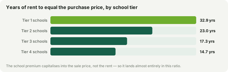
This is the clearest evidence on the site for something we argue in other ways: the money families pay for a strong school district lands in the sale price, not the rent. A renter in Weston and a renter in a Gateway City pay roughly comparable rents; a buyer in Weston pays for the district, and pays it as a purchase premium that takes decades of rent to match. Renting, in the most sought-after towns, is the relative bargain — you get the address without buying the capitalised value of the schools.
From the Gateway Cities to the western suburbs
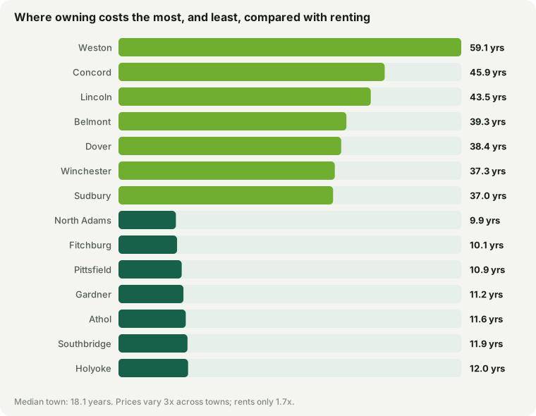
| Dearest to own vs rent | Years of rent |
|---|---|
| Weston | 61.3 |
| Concord | 45.2 |
| Lincoln | 42.4 |
| Dover | 39.7 |
| Belmont | 38.4 |
| Sudbury | 37.2 |
| Winchester | 36.4 |
| Cheapest to own vs rent | Years of rent |
|---|---|
| North Adams | 9.4 |
| Fitchburg | 9.4 |
| Pittsfield | 10.3 |
| Athol | 10.4 |
| Winchendon | 10.6 |
| Gardner | 10.6 |
| Southbridge | 11.1 |
At the low end are the Gateway Cities and the western towns — North Adams, Fitchburg, Pittsfield — where a house costs about a decade of rent and owning pays for itself quickly against renting. At the high end are the prestige suburbs — Weston, Concord, Lincoln — where the price is a bet on the schools, the address and future appreciation far more than on the shelter itself. Neither is a verdict: a low ratio can mean a soft market as easily as a bargain. It only tells you what share of the price the rent can explain.
What this is and isn’t
One important caveat. The rents here are HUD Small Area Fair Market Rents — 40th-percentile, standard-quality figures. In the priciest towns the true market rent for a large single-family runs well above the FMR, so the headline ratios at the very top are an upper bound: Weston’s real figure is lower than the number shown. But the gradient is robust to that — prices vary several times as widely as any plausible rent correction, so which towns are dear to own and which are cheap does not change. The 4BR price is our market estimate, not an appraisal, and this is a description of the market, not buy-or-rent advice for any one house — for that, the full rent-versus-buy math depends on your mortgage rate and how long you stay.
Checked against observed prices
The 4BR price is the one modelled input here, so it is worth testing against figures that are not. Zillow publishes observed medians for three-bedroom homes and for an open top bucket of five bedrooms or more, though not for four. In 21 of the 22 Tier 1 towns with both, the modelled 4BR sits between them, which is where a four-bedroom house has to land. On the observed figures a Tier 1 home costs 23.5 years of rent at three bedrooms and 40 at five or more — bracketing the 32 above.
The check does add one thing a reader should know. Measured on a three-bedroom home, the gap between the top and bottom school tiers is about 1.5 times rather than more than two. The school premium is steepest on the family-size house, which is the same fact as the price of an extra bedroom seen from the other side: in the towns with the strongest schools, space is what costs the most.
Price-to-rent is each town’s modelled 4BR price divided by twelve times its 4BR HUD FY2027 Small Area Fair Market Rent. Site data updated September 17, 2026. Every town’s prices and rents are on its own town page.