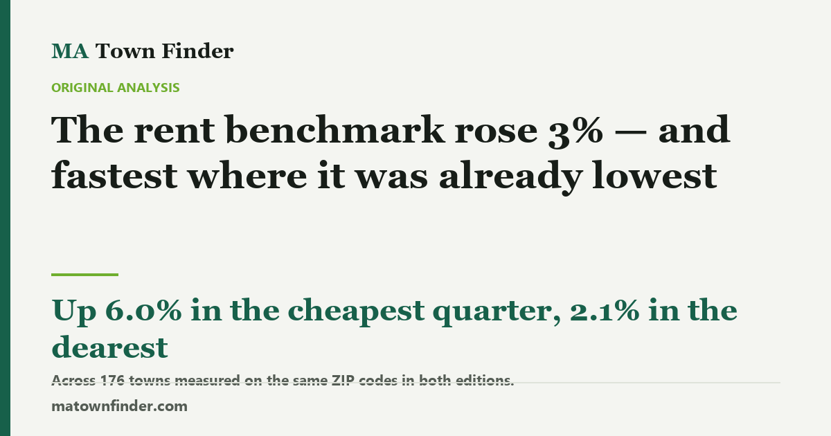
The rent benchmark rose 3% — and fastest where it was already lowest
HUD replaced its Massachusetts rent table for FY2027, and this site now holds both editions — the first rent change it can measure rather than a level. Across the 176 towns whose figures are built from the same ZIP codes in both, the median three-bedroom benchmark rose 3.2%, from $3,134 to $3,267. It rose 6.0% in the quarter of towns where rents were lowest and 2.1% in the dearest quarter. Sorted by house price instead, the pattern reads like a story about cheap towns — and that reading does not survive a model: beside the starting rent, house price and commute collapse to nothing.
Every rent figure this site has ever published has been a level: what HUD says a three-bedroom costs in the ZIP codes around a town, used to work out whether buying beats renting there. HUD replaced the whole table when its FY2027 rents took effect on 1 October, and for the first time this site holds both editions. So for the first time it can measure a change rather than a level.
Before the finding, what the number is, because it decides what the finding means. These are administrative benchmarks — the 40th percentile of standard-quality units, the figure a housing voucher pays toward — not asking rents. They follow the market with a lag and through a formula. What moved here is the benchmark.
Up about 3%, almost everywhere
The median town’s three-bedroom benchmark went from $3,134 to $3,267, a rise of 3.2%. It rose in 157 of the 176 towns compared here and fell in 19. The other bedroom sizes did much the same: 1 bedroom 3.2%, 2 bedrooms 3.5%, 3 bedrooms 3.2%, 4 bedrooms 3.5%.
Over the same twelve months the typical town’s house price rose 1.9%. The benchmark outran the house in 127 of 176 towns.
It rose fastest where it was already lowest
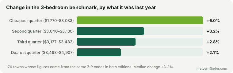
Split the towns into quarters by last year’s benchmark and the gradient is steep. Where the benchmark was between $1,770 and $3,033, it rose 6.0%. Where it was $3,493 or more, it rose 2.1% — about a third as fast. The cheap end of the table is catching up with the dear end.
The catching-up is real but small, and worth stating at its true size rather than a flattering one. The gap between the 90th and 10th percentile town narrowed from 1.59 to 1.57 times over the year. A decade of that would matter; one year of it moves the tenth-percentile town from $2,450 to $2,507.
Why this is not the story it first looks like
Sort the same towns by what a house costs instead and you get a pattern that reads like a much better headline: the cheapest quarter of towns saw the benchmark rise 5.3% and the dearest 2.2%. By school tier it is the same shape — Tier 4 towns up 5.1%, Tier 1 towns up 1.3%. Rents rising fastest in the cheap towns and the weak districts is a story with obvious consequences, and on its own the correlation supports it: −0.31 against house price, which on 176 towns is not a fluke.
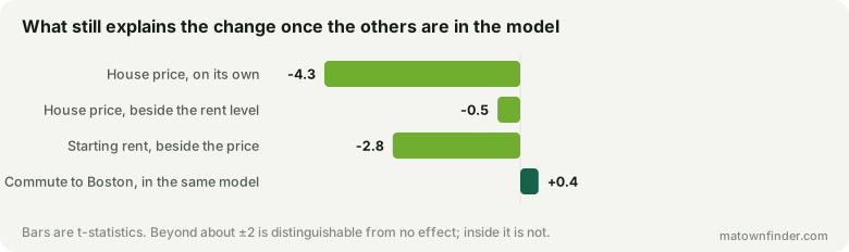
It does not survive the obvious control. Cheap towns have cheap rents, so “rose fastest where houses are cheap” and “rose fastest where rents are low” are two descriptions of one overlapping set of places. Put all three candidates in a single model and only one is left standing: the starting rent holds at t = −2.8, while house price falls to −0.5 and the commute to Boston to 0.4. Alone, house price looked like a real effect at t = −4.3. Next to the rent level it is nothing.
So the honest claim is narrower than the one the second chart invites. The benchmark did not rise fastest in poor towns, or far towns, or weak districts. It rose fastest where it was low, wherever that was.
The towns where it fell
19 towns saw the three-bedroom benchmark fall, led by Weston (−3.5%), Dover (−3.5%), Westborough (−3.3%), Northborough (−3.3%). The tempting reading is that these are the expensive holdouts correcting, and it is wrong: ten of the 19 are at or below the median town price, including Worcester, Greenfield, Auburn. Falls are rare, small — none is larger than 3.5% — and scattered.
The largest rises are larger and rarer still: Berlin (26.3%), Bolton (20.8%), Palmer (16.9%). A town’s figure here is an average of its nearest ZIP codes, so a double-digit move usually means HUD revised one of those ZIPs sharply, not that the town’s rental market did something dramatic.
What it does to the buy-versus-rent question
Mechanically, the thing this site uses rent for moves in renting’s disfavor. The price-to-rent ratio — house price over a year of benchmark rent — fell in 157 of 176 towns, with the median going from 21.0 to 20.2, because rents rose faster than prices did.
That is a real shift and a small one, and it does not move any town across the boundaries that piece draws. A ratio near 20 still means the same thing it meant last year. Nobody should change a decision over eight tenths of a point.
What this cannot tell you
- It is not asking rent. A 40th-percentile standard-quality benchmark sits below what a nice four-bedroom in a strong district actually lets for. The price-to-rent piece says so at length, and a change in the benchmark inherits the same gap.
- A formula can converge without a market converging. Compression inside an administrative series is at least as likely to be HUD’s method as the rental market, and nothing in this data separates them. That is the main reason this piece stops at describing the benchmark.
- It is ZIP codes, not town lines. Each town here averages its nearest ZIPs, which is why 47 of the 223 towns are missing from every figure above: the number of ZIPs averaged changed between editions, so their two readings are not built from the same places and the difference would be partly a change of method.
- One year is one year. There is no trend here, only a difference. The site will have a third edition next autumn.
How this was measured
Rents are HUD Small Area Fair Market Rents, 40th percentile, by ZIP code, averaged across each town’s nearest ZIPs: the FY2027 edition against the FY2026 edition this site carried until September 2026. The previous edition is recovered from the repository’s own history rather than re-downloaded, so it is exactly what was published here. Of 223 towns with both editions, 176 averaged the same number of ZIP codes in both and are the ones compared; the other 47 are excluded. Headline figures are the three-bedroom rent. House prices are this site’s modeled median four-bedroom value and the price change is the last year of the Zillow index. The model is least squares on the percentage change, with log starting rent, log house price and minutes to Boston. See the methodology, or download the tables. Figures as of September 17, 2026.