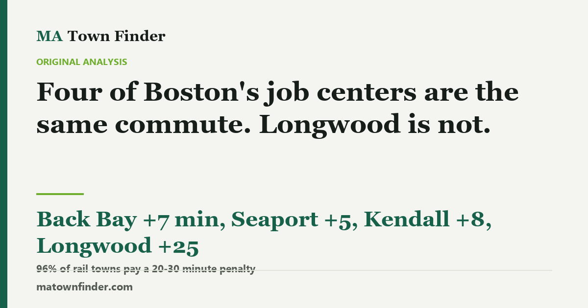
Four of Boston’s job centers are the same commute. Longwood is not.
Every commute figure published anywhere, including everywhere else on this site, is a journey to downtown Boston. Measured against real MBTA timetables from 79 rail-served towns, Back Bay costs 7 minutes more than downtown, the Seaport 5, Kendall 8 — and the Longwood Medical Area 25. The remarkable part is how little that varies: 96% of towns land within a 20-to-30-minute penalty, because the network is built to deliver people to South Station and North Station and Longwood is neither.
Every commute figure you have ever been quoted for a Massachusetts town means the same thing: how long it takes to get to downtown Boston. Every listing, every relocation guide, every “X minutes to the city” on a town website. Including, for what it is worth, most of this site.
It is a reasonable default and it is wrong for a lot of people. Boston does not have one job centre; it has several, and one of the largest is the Longwood Medical Area — the hospital and medical-school district a couple of miles west of downtown. If that is where you work, the number you have been given is not your commute.
Four are the same. One is not.
This site holds scheduled MBTA journey times from every rail-served town to five destinations, computed from the published timetable rather than modelled. 79 towns have a scheduled journey to all five, so the comparison below is five figures for one set of places — what changes is the destination, not the sample.
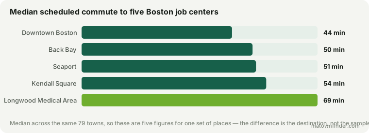
Downtown is a median 44 minutes. The Seaport is 51, Back Bay 50, Kendall Square 54. Those four sit inside 8 minutes of each other, which is close enough that for most purposes a single number really does describe them all.
Longwood is 69 minutes.
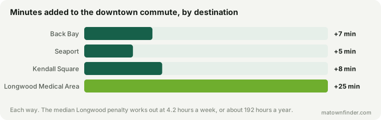
A median 25 minutes on top of the downtown journey, each way. That is 50 minutes a day, 4.2 hours a week, and somewhere around 192 hours a year — a working month, spent getting to a place two miles past the station everyone else gets off at.
The strange part is the consistency
You might expect a penalty like this to be a geography story: bad from the north, fine from the west, something like that. It is not. Across the 79 towns the penalty tops out at 29 minutes, and 76 of them — 96% — land between 20 and 30. Only 3 towns do better than twenty. In exactly one place is Longwood the closer destination — Newton, by 12 minutes, because the D branch of the Green Line runs through it and past the hospitals. The other two are Fitchburg and Leominster, which are not close to anything: their downtown journeys already run well past an hour, so the transfer is a smaller share of an already long morning rather than a shorter one in absolute terms.
That flatness is the finding, and it points at the cause. This is not about how far your town is from Longwood. It is that the commuter rail network exists to deliver people to South Station and North Station, Longwood is neither, and so almost everybody pays the same transfer regardless of where they boarded. Andover is 43 minutes from downtown and 72 from Longwood. The gap is not a function of the distance; it is a function of the map.
Where it actually works
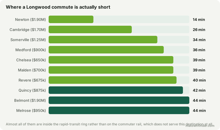
Newton is the standout at 14 minutes — shorter than its own downtown journey of 26, which is the only town on the list where that is true, and entirely because the D branch runs through it. After that the pattern is the inner ring: Cambridge 26, Somerville 34, Medford 36, Chelsea 39 minutes.
If you work at Longwood and want the commute to be tolerable without paying inner-ring prices, the useful list is the cheap end of what is still inside an hour:
| Town | To Longwood | To downtown | 4BR | Schools |
|---|---|---|---|---|
| Chelsea | 39 min | 18 min | $650k | Tier 4 |
| Lynn | 54 min | 28 min | $650k | Tier 4 |
| Randolph | 56 min | 32 min | $650k | Tier 4 |
| Revere | 40 min | 17 min | $675k | Tier 4 |
| Malden | 39 min | 11 min | $700k | Tier 4 |
| Weymouth | 56 min | 28 min | $725k | Tier 3 |
| Canton | 58 min | 31 min | $825k | Tier 3 |
| Woburn | 56 min | 30 min | $825k | Tier 3 |
| Dedham | 54 min | 29 min | $850k | Tier 3 |
| Braintree | 48 min | 25 min | $875k | Tier 3 |
Note what that table is not. It is not a list of good towns — the school tiers there are mostly 3 and 4, and this site spends a lot of its time explaining what that costs a family. It is a list of towns where one specific commute is survivable at a price most people can reach, which is a narrower and more honest claim.
What this does not measure
These are station-to-station times. They exclude getting to your origin station and the walk at the far end, and for Longwood that second omission matters more than usual: the medical area is spread over several blocks, and the difference between the nearest stop and the far end of it is a real ten minutes on foot. Treat the figures as a floor.
They are also scheduled times, taken from a 07:00–09:30 arrival window on a weekday. The timetable is what the MBTA intends to run, not a promise about any particular morning. 4 of the towns here — Andover, Foxborough, Gloucester, Haverhill — have so few scheduled options to Longwood that a single cancellation is the whole service, and the figures above flatter them.
And it covers rail only. A town with no station has no row here, which is most of Massachusetts; driving to Longwood is its own problem and parking there is a famous one.
How to use this
- Ask which Boston, before you shortlist. If the household works downtown, at Back Bay, in the Seaport or at Kendall, the standard figure is close enough. If anyone works at Longwood, add 25 minutes to every town you are looking at.
- The penalty is nearly flat, so it will not rank your list. Moving to a different suburb barely changes it. The only towns that escape it are the ones the Green Line reaches.
- Two hospital workers change the maths entirely. 192 hours a year each is not a rounding error against a school premium, and it is the sort of cost that never appears in a listing.
- Check the town page. Every destination page carries the full scheduled figures, town by town.
How this was measured
Scheduled station-to-station journey times from the MBTA’s published GTFS feed, computed by a RAPTOR search over weekday services arriving between 07:00 and 09:30, transfers included. The figure used throughout is the typical journey rather than the single fastest one, because the best service of the morning is not what most people catch.
Towns are included only where the timetable provides a journey to all five destinations, which is 79 of them; a town containing a destination is dropped rather than recorded as a zero. Prices and school tiers are this site’s own — see the methodology, and download the commute table if you want to check any of this. Figures as of September 17, 2026.