Massachusetts is not one housing market. It is twelve.
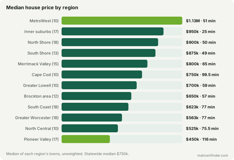
Every study on this site pools 223 towns and reports a median that describes nowhere. Split them into the twelve regional planning agency rosters instead and the state resolves into distinct products: MetroWest at $1.13M with the best schools in the state, the inner suburbs at a 25-minute commute and a middling 53rd MCAS percentile, the Cape at little more than half the median tax bill, the Pioneer Valley at $450,000 and two hours out. The map that barely works between towns works between regions — commute predicts regional price at −0.72, and price predicts regional test scores at 0.87.
Almost everything on this site pools the towns and reports a median. The median Massachusetts house is $750k, the median tax bill $8,786, the median commute 62 minutes. Those are the right numbers for a question about the state and the wrong ones for anybody choosing a part of it, because the median describes nowhere in particular.
The site has carried 12 regions since the region pages were built and has never once set them against each other. Doing it turns out to reorganize the whole picture: Massachusetts is not one market with a price gradient running out of Boston. It is a set of distinct products, each expensive in its own currency.
Four regions, four different things for sale
MetroWest is schools. At $1.13M it is the dearest region in the state, and it is the only one where the top school tier is the most common one — 5 of its 10 towns are Tier 1, and its median district sits at the 93rd MCAS percentile. Its median tax bill, $15,406, is the highest of the twelve.
Inner Boston suburbs are proximity, and nothing else reliably. A median commute of 25 minutes, against 49 for the next-closest region — for $950k. What that money does not buy is a school district: the median is the 53rd percentile, below the statewide 56th, and 4 of its 17 towns are in the bottom tier.
Cape Cod is tax and water. The lowest median rate of the twelve at 6.59, a median bill of $4,890 on houses priced at $750k — and the only region where every town lands in one school tier, so the comparison a buyer runs everywhere else has nothing to work on.
Pioneer Valley is price. $450k, which is 40% below the statewide median, at the cost of 116 minutes to Boston and the highest median tax rate of the twelve at 15.24.
The cheapest region does not pay the smallest tax bill
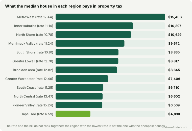
Cape Cod has the lowest median rate and Pioneer Valley the highest — 6.59 against 15.24, more than double. But Pioneer Valley also has the cheapest houses, so its median bill comes out at $6,569 — and Cape Cod, on houses 67% dearer, still pays less at $4,890.
That is the rate-versus-bill problem at regional scale, and it is the reason a relocation guide that ranks places by tax rate is worse than useless: it will point you at the Cape for the right reason and at Pioneer Valley for the wrong one.
Between regions, the map works
Here is the part that reframes two earlier pieces here. Between individual towns, commute time explains about a quarter of what a house costs — Lawrence and Duxbury are the same 58 minutes out at $500k and $1.4M. Between regions, the same relationship is r = −0.72. And price against school scores, which is loose between towns, is 0.87 between regions.
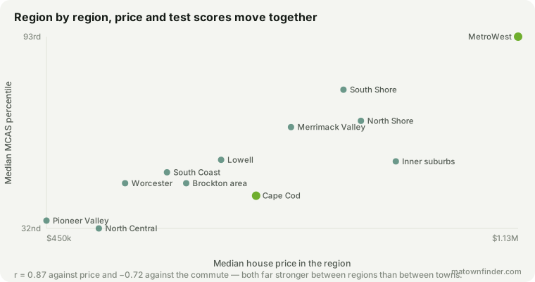
Both things are true and neither cancels the other, but the reason they differ is worth being plain about rather than presenting the tidier number as the truer one. Averaging a region’s towns throws away the variation within it, and that variation is most of what made the town-level relationship look weak. A correlation computed on twelve averages will almost always beat the same correlation computed on 223 places. It is a real property of the data, not a stronger version of the same finding.
What it means for a reader is a two-step decision rather than one. Choosing a region, the map is a good guide and the trade is roughly the one everybody expects: distance for price, price for schools. Choosing a town within a region, the map tells you almost nothing and the town itself does the work.
Spending does not sort them either
Per-pupil spending across the twelve runs from $18,784 (Brockton area & Old Colony) to $24,828 (Cape Cod). Against test scores that comes out at r = 0.47 — loosely positive, and far weaker than price at 0.87.
Cape Cod is what breaks it: the most spent per pupil of any region, and the 3rd-lowest median MCAS percentile. That is the same conclusion as the per-pupil study arrived at across 223 towns, holding at a scale where it could easily have washed out.
All twelve
| Region | Towns | 4BR | Rate | Bill | Commute | MCAS | $/pupil | Tiers 1/2/3/4 |
|---|---|---|---|---|---|---|---|---|
| MetroWest | 10 | $1.13M | 12.44 | $15,406 | 51 | 93rd | $23,780 | 5/2/2/1 |
| Inner Boston suburbs | 17 | $950k | 11.14 | $10,897 | 25 | 53rd | $22,165 | 3/3/7/4 |
| North Shore | 18 | $900k | 10.78 | $10,629 | 50 | 66th | $22,976 | 0/8/9/1 |
| South Shore | 13 | $875k | 10.81 | $8,835 | 49 | 76th | $21,034 | 0/6/5/2 |
| Merrimack Valley | 15 | $800k | 11.24 | $9,672 | 65 | 64th | $23,135 | 0/4/8/3 |
| Cape Cod | 10 | $750k | 6.59 | $4,890 | 99.5 | 42nd | $24,828 | 0/0/10/0 |
| Greater Lowell | 10 | $700k | 12.78 | $8,817 | 59 | 54th | $20,863 | 1/2/6/1 |
| Brockton area & Old Colony | 12 | $650k | 12.82 | $8,645 | 57 | 46th | $18,784 | 0/0/11/1 |
| South Coast | 18 | $623k | 11.25 | $6,710 | 77 | 50th | $19,028 | 0/0/13/5 |
| Greater Worcester | 18 | $563k | 12.46 | $7,406 | 77 | 46th | $19,383 | 2/2/8/6 |
| North Central Massachusetts | 10 | $525k | 13.47 | $6,602 | 75.5 | 32nd | $19,544 | 1/1/1/7 |
| Pioneer Valley | 17 | $450k | 15.24 | $6,569 | 116 | 34th | $20,753 | 0/2/10/5 |
Every figure is the median of the region’s towns, unweighted by population — a region is a set of places to choose between, which is the question this answers.
What a region is here, and what it is not
These are the published rosters of the regional planning agencies — MAPC subregions, the Pioneer Valley and Merrimack Valley commissions, and the Cape Cod Commission. They are not lines drawn for this site. “North Shore” and “MetroWest” have no legal boundary and everyone draws them differently; an agency roster is published, citable, and used by the municipalities themselves.
Three limits follow, and none of them is small.
- The twelve are not a partition of the state. The rosters name 180 municipalities and this site holds 167 of them, out of the 223 it covers and the 351 in Massachusetts. Boston itself is in none of them.
- They are not the same size. Ten towns against eighteen. A ten-town median moves on one town, so treat the small regions as sketches.
- Southborough is in two rosters. It is left in both, because dropping it from one would be this site overruling an agency about its own membership — which means the town counts above sum to one more than the towns they describe.
How to use this
- Pick the region first, then the town. The two decisions run on different rules: the region sets the trade between distance, price and schools, and the town decides almost everything else.
- Know which currency you are paying in. MetroWest at $1.13M and Cape Cod at $750k are not the same purchase at a different price. One is a school district and the other is a tax rate and a coastline.
- Never shortlist on a tax rate. The region with the highest median rate has the cheapest houses, and 10 of the other eleven charge a lower rate and send a bigger bill.
How this was measured
Region membership is from the agency rosters in this site’s region pages, filtered to the towns it actually covers; the towns a roster names that this site does not hold are listed on each region page rather than hidden. Prices are the modeled median 4BR, rates are FY2026 residential rates, and the bill is rate times price. MCAS percentiles are DESE’s district figures; per-pupil spending is DESE’s per-pupil expenditure report, which belongs to a district and so repeats across the member towns of a shared one.
Correlations are computed across the twelve region medians, not across towns, and are reported as such throughout — a correlation on twelve averages is a different statistic from the same correlation on 223 places, and the article says where that matters. See the methodology, or download the tables. Figures as of September 11, 2026.