The cheap towns grew fastest. The expensive ones made far more money.
Ten years of Zillow data for 223 towns. In percentage terms the gap closed: the cheapest quarter grew 6.7% a year against the dearest quarter’s 5.4%. In dollars it opened by $246,000. Both are true, and which one matters depends on whether you already own.
This site now carries 10 years of home values for every town, so it can answer a question it never could: which places actually appreciated, and by how much.
The answer depends entirely on which unit you ask in, and the two units disagree so completely that they support opposite conclusions. Neither is wrong. They are answers to different questions.
In per cent, the cheap towns won
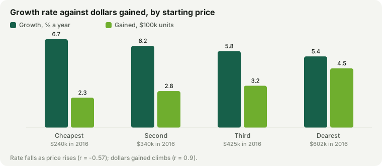
Sort all 223 towns by what they cost in 2016 and the growth rate falls steadily as the price rises. The correlation between a town’s 2016 price and its annual growth is -0.57.
| Towns by 2016 price | 2016 | 2026 | A year | Gained |
|---|---|---|---|---|
| Cheapest quarter | $240k | $459k | 6.7% | $228k |
| Second | $340k | $617k | 6.2% | $278k |
| Third | $425k | $753k | 5.8% | $318k |
| Dearest quarter | $602k | $1.07M | 5.4% | $450k |
The cheapest quarter of towns compounded at 6.7% a year; the dearest at 5.4%. The same pattern runs through the school tiers, which is the uncomfortable version: Tier 4 districts grew at 6.8% and Tier 1 — the ones everyone competes for — at 5.3%. Growth and school quality run in opposite directions, at -0.54.
| Fastest growing | A year | 2016 → 2026 |
|---|---|---|
| Athol | 9.1% | $142k → $341k |
| Lawrence | 8.8% | $224k → $522k |
| Fitchburg | 8.8% | $176k → $410k |
| Gardner | 8.3% | $171k → $381k |
| Winchendon | 8.3% | $185k → $411k |
| Springfield | 8.1% | $141k → $308k |
| Slowest growing | A year | 2016 → 2026 |
|---|---|---|
| Brookline | 2% | $914k → $1.11M |
| Cambridge | 3.2% | $761k → $1.04M |
| Boston | 3.5% | $561k → $789k |
| Somerville | 3.6% | $660k → $941k |
| Watertown | 4.8% | $531k → $847k |
| Sharon | 4.8% | $559k → $898k |
Read only that and the conclusion writes itself: the old mill towns and the Gateway Cities were the decade’s investment, and Brookline at 2% a year was the worst place in Massachusetts to have put your money.
In dollars, the expensive towns won — and it is not close
Now ask the same data how much money each town made its owners. The correlation between the 2016 price and the dollars gained is 0.9 — one of the strongest relationships anywhere on this site, and it points the other way.
The dearest quarter gained a median $449,661. The cheapest gained $227,775. A lower rate on a much larger number is still a much larger number: Tier 1 districts put $490,699 on the median house while Tier 4 managed $235,269.
| Most dollars gained | Gained | A year |
|---|---|---|
| Weston | $963,053 | 5.5% |
| Wellesley | $862,475 | 5.5% |
| Dover | $714,491 | 5.1% |
| Needham | $704,869 | 6% |
| Chatham | $684,147 | 7.3% |
Not one of those is a fast grower. Weston put nearly a million dollars on the typical house while compounding more slowly than Athol.
So did the gap close or open?
Both, and this is the crux. Measured as a ratio, the distance between the dearest and cheapest quarter narrowed from 2.5× to 2.32×. Measured in money, it grew from $361,631 to $608,122.
The ratio narrowed by a fifth of a point. The cash gap widened by $246,491. If you are trying to move up the ladder, the second number is the one you have to save, and convergence in percentages did nothing whatever for you.
Which number applies to you
- If you already own, the percentage is your return and the dollars are your equity. Owners in the cheap towns did proportionally better; owners in the dear ones got more money. Both groups did well, in different currencies.
- If you are trying to buy into a better district, only the dollars matter — and the gap you have to cross got $246,491 wider. The percentage convergence is cold comfort.
- If you are choosing where to buy now, neither figure is a forecast. A decade in which the cheapest towns nearly doubled is not a promise about the next one, and the towns that ran hardest were starting from post-crisis lows that no longer exist.
What this does not say
It does not say the cheap towns are better buys now. Much of that growth is a recovery from a low base — Athol at $142k in 2016 was cheap in a way that reflected real problems, and it is now $341k, which is a different proposition. It does not say the expensive towns are safe either: the same leverage that turned a modest rate into $449,661 works in reverse.
And it says nothing about the schools, the commute or the town itself, which is the rest of what you are buying. The site’s worked comparison of staying against moving shows how much a growth assumption can swing a housing decision — and this is the evidence behind the rates it now uses.
How this was measured
The Zillow Home Value Index for every Massachusetts municipality this site covers, mid-year 2016 against mid-year 2026 — 223 towns. Boston’s neighbourhoods are excluded because they share the citywide series, so including them would enter one observation eighteen times. Growth is compound annual; the gain is simply the difference between the two years. Quartiles are cut on the 2016 value, and every figure quoted for a group is its median. Correlations are Pearson’s r. ZHVI is a whole-town index of typical value, which is not the same thing as this site’s 4BR estimates and will not match them; it is the series those estimates are calibrated against. Figures as of September 11, 2026. Every town’s own ten-year chart is on its page in the town finder.