Test scores tell you who moved in. Growth tells you what the school did.
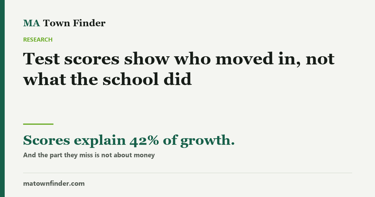
Massachusetts publishes two figures for every district and buyers read one. Achievement explains just 42% of growth — and the part it misses is almost unrelated to house prices. At every score level, districts differ by up to 18 points on how far they move children.
Massachusetts publishes two numbers about every school district, and almost every buyer reads one of them.
Achievement is how well the district’s pupils score. It is the figure behind every ranking, and it is substantially a fact about the children who already live there — it correlates with local house prices at 0.7. Growth is different: it measures how far pupils moved over a year, compared with pupils across the state who started in the same place. It is the closest thing published to what the school itself added.
The two are related — a district scoring well tends to grow well, at a correlation of 0.65. This is not a story about opposites. But related is not the same as interchangeable, and the gap between them is where the useful information sits.
Achievement explains less than half of growth
Fit growth against achievement across all 203 districts and achievement accounts for 42% of it. The other 58% is something the test score does not carry.
The obvious worry is that the leftover is simply wealth again — that the districts beating their predicted growth are the rich ones. They are not. The part of growth that achievement fails to explain correlates with house prices at 0.18 — near enough to nothing.
That is the finding worth carrying away. Achievement is largely a proxy for who lives in the town. Growth contains real information that achievement misses, and that extra information is not just money in another costume.
At every score level, districts differ sharply
The practical version of this is the comparison a buyer actually faces: two towns whose test scores look alike. Group districts by achievement and the spread in growth inside each group is large.
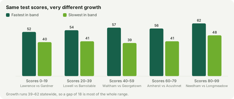
| Achievement band | Districts | Fastest growth | Slowest growth | Gap |
|---|---|---|---|---|
| 0–19 | 30 | Lawrence (52) | Gardner (40) | 12 |
| 20–39 | 42 | Lowell (54) | Barnstable (41) | 13 |
| 40–59 | 41 | Waltham (57) | Georgetown (39) | 18 |
| 60–79 | 41 | Amherst (56) | Acushnet (41) | 15 |
| 80–99th percentile | 49 | Needham (62) | Longmeadow (48) | 14 |
Those gaps are larger than they look, because growth is a compressed scale: across the whole state it runs from 39 to 62, a range of 23 points. A gap of 18 inside a single achievement band — which is what Waltham and Georgetown show, both scoring in the 40s — is most of the entire spread the state produces.
It happens at the top too. Among districts in the 80–99 band — the ones everyone is bidding for — Needham grows children at 62 and Longmeadow at 48. Both look like excellent districts on a ranking. One is doing considerably more with the children it has.
Beating the expectation, and missing it
Another way to read the same thing: what a district’s growth would be predicted from its achievement, against what it actually is.
| Growing children faster than predicted | Achievement | Growth | Expected | Difference |
|---|---|---|---|---|
| Waltham | 45th | 57 | 49 | +8.2 |
| Needham | 97th | 62 | 54 | +8.0 |
| Lowell | 24th | 54 | 47 | +7.4 |
| Lawrence | 5th | 52 | 45 | +7.3 |
| Bourne | 27th | 54 | 47 | +7.1 |
| Salem | 21st | 53 | 46 | +6.7 |
| Winthrop | 51st | 56 | 49 | +6.6 |
| Westborough | 91st | 60 | 53 | +6.6 |
| Acton-Boxborough | 92nd | 60 | 54 | +6.5 |
| Brookline | 93rd | 60 | 54 | +6.4 |
The list mixes two kinds of district, which is the point. Needham, Westborough, Brookline and Lexington are high-scoring towns that are also moving children faster than even their intake predicts. Lowell, Lawrence and Salem score near the bottom of the state on achievement and are nonetheless moving children faster than districts with similar scores — Salem sits at the 21st percentile on achievement and grows at 53, against 46 predicted.
| Growing them slower than predicted | Achievement | Growth | Expected | Difference |
|---|---|---|---|---|
| Georgetown | 45th | 39 | 49 | -9.8 |
| Acushnet | 63rd | 41 | 51 | -9.6 |
| Danvers | 41st | 42 | 48 | -6.4 |
| Fairhaven | 56th | 44 | 50 | -5.9 |
| Wrentham | 74th | 46 | 52 | -5.7 |
| East Bridgewater | 34th | 42 | 48 | -5.6 |
| Pembroke | 62nd | 45 | 50 | -5.5 |
| Mount Greylock | 70th | 46 | 51 | -5.3 |
| Sturbridge | 60th | 45 | 50 | -5.3 |
| Barnstable | 20th | 41 | 46 | -5.2 |
Several of these are comfortable, well-regarded towns with respectable test scores. A parent reading only the score would never find this, and it is exactly the case where a school visit and a question about progress data would be worth the afternoon.
What this is not
- It is not proof a school is good or bad. Growth is a measure of one year’s progress on one set of tests. It is noisier in small districts, it says nothing about a school beyond what the tests examine, and a single year can move it.
- It is not a reason to ignore achievement. Where the children are matters — peers, pace, what a classroom can assume. The argument is for reading both, not swapping one for the other.
- It does not identify the cause. A district that beats its predicted growth is doing something the data cannot name, and it might be teaching, programme design, or something outside the school entirely.
How to use it
When two towns on your shortlist have similar test scores and similar prices, growth is the tiebreaker the listings do not show you. When a town’s scores look poor but you like everything else about it, growth tells you whether the schools are struggling or simply serving children who arrived further back. Both figures are on every town page here, side by side, which is where the comparison ought to start.
It also pairs with the other things this site has found are not quality signals: per-pupil spending and the reminder that a district figure is an average across many schools.
How this was measured
Achievement is the district’s statewide percentile on MCAS; growth is its mean student growth percentile, both from DESE. Growth compares a pupil against pupils statewide who scored similarly in prior years, which is why it is not simply achievement again. Rows are districts, not towns — 203 of them — because a regional district reports one figure across several towns. The prediction is an ordinary least-squares fit of growth on achievement; the difference column is the residual from that fit. Correlations are Pearson’s r. Figures as of September 11, 2026. Every town’s achievement and growth figures are on its page in the town finder.